paradigm poster font
Scroll for Details
DETAILS
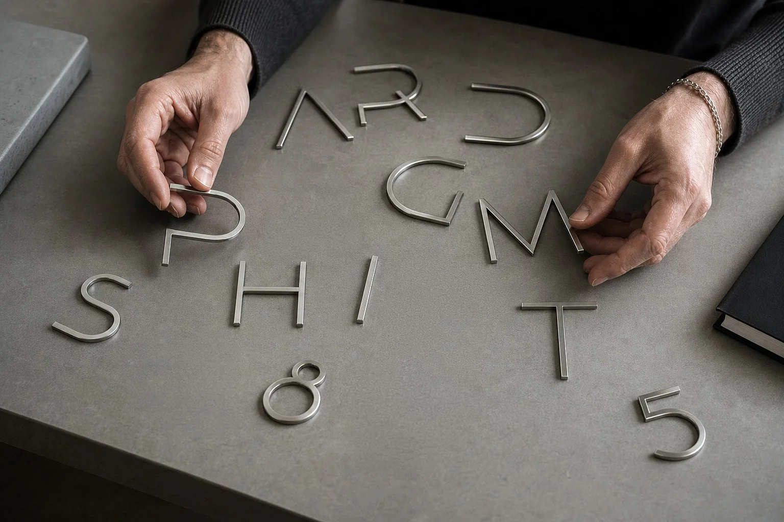
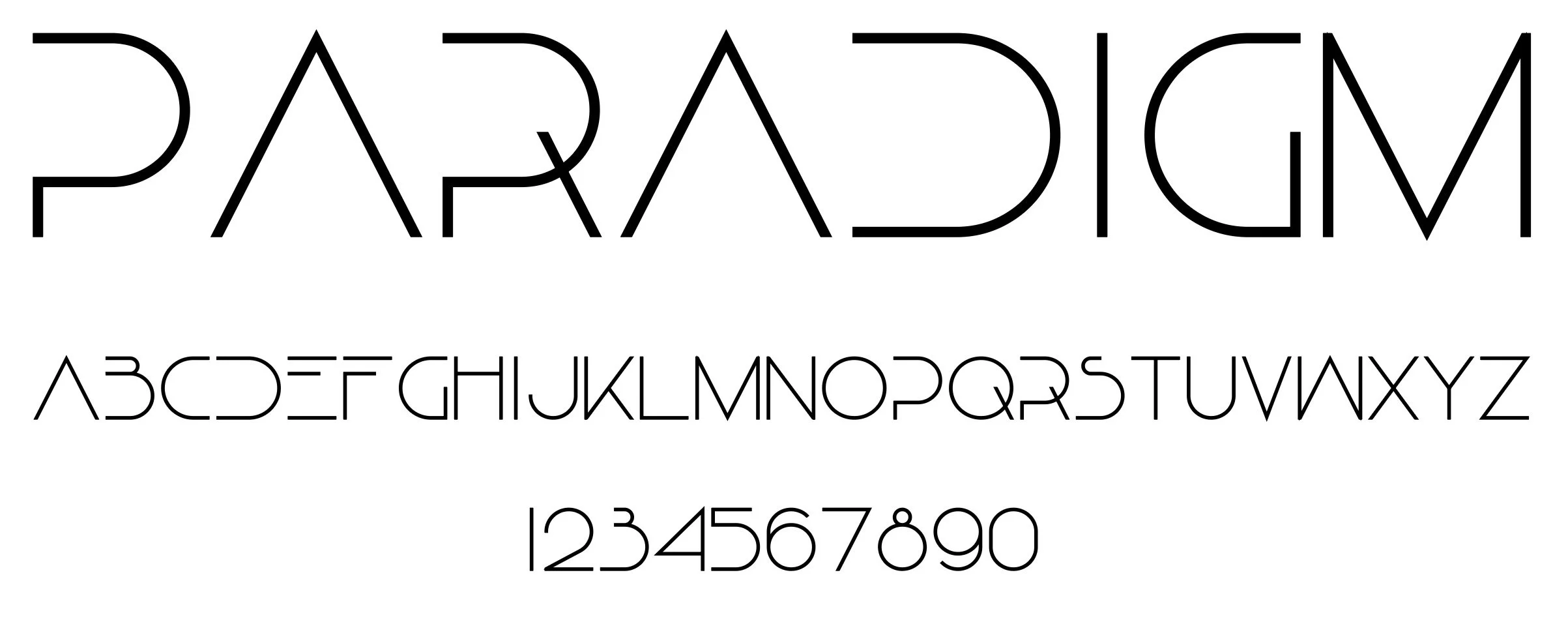
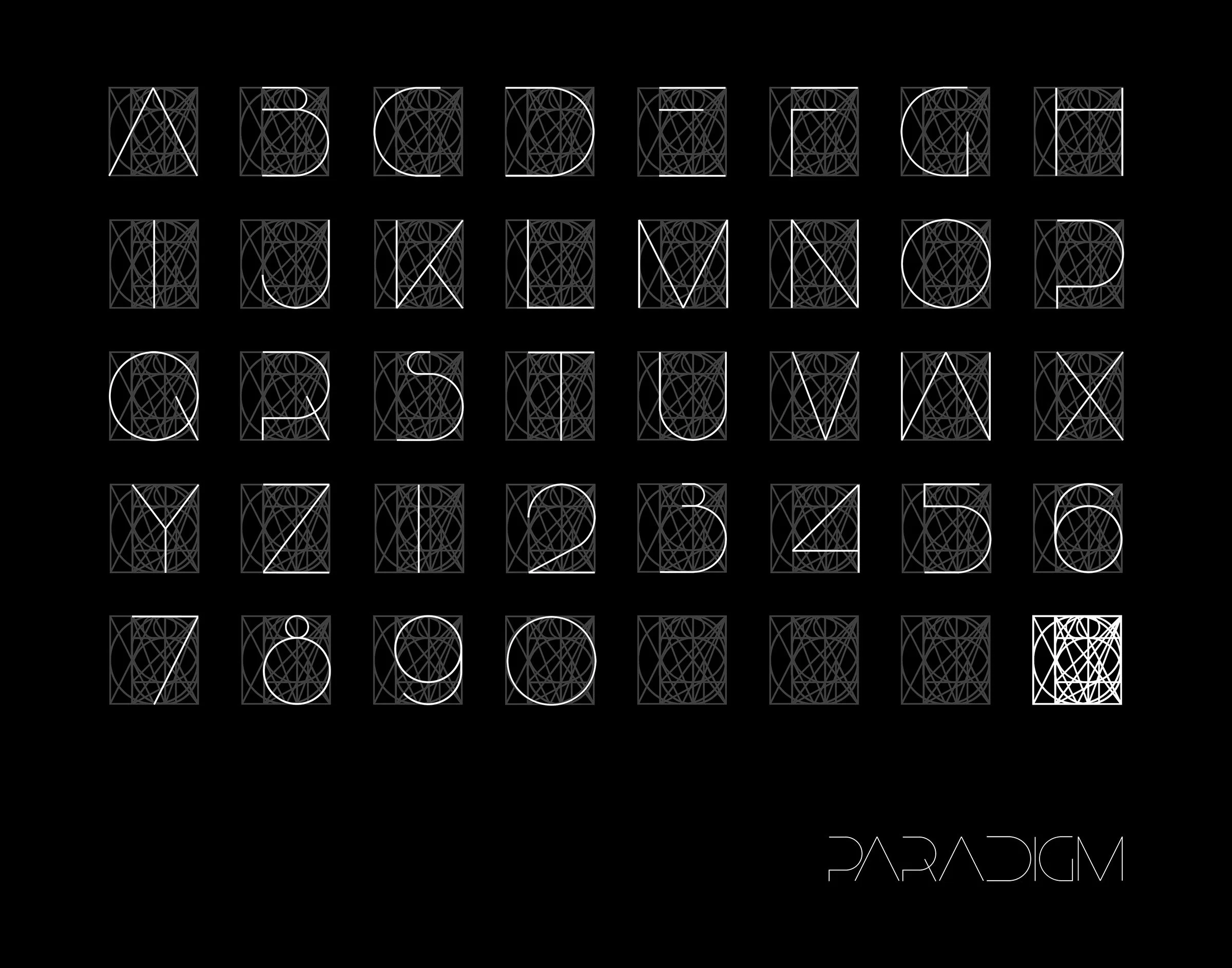
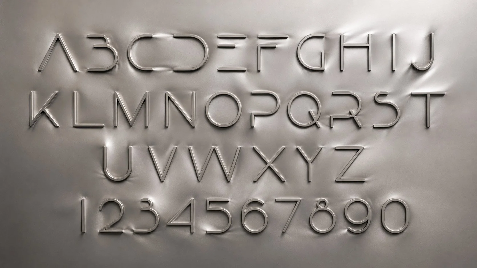
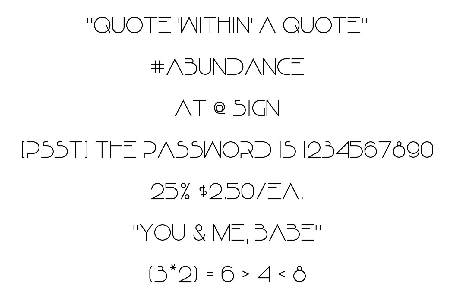
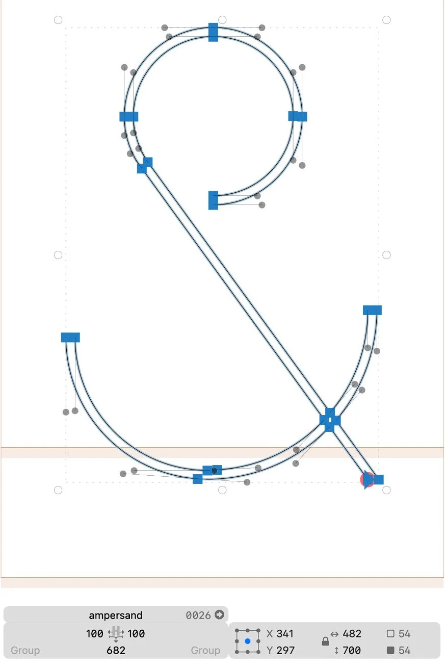
I’ve always loved fonts because they elevate letters and words to art, not unlike calligraphy. Upon graduating, I embarked on the design of my first font — one made in homage to the Vienna Secession and its love of expressive form. Here, I decompose each letter to create a so-called “poster font” aiming for what I felt was its minimal form while maintaining legibility, which is another way of saying I was using maximum repetition. The font’s logo — a palimpsest of every letter and number — was how I chose to judge whether it was successful. To my eye, it looks like a monogram from the era of Hoffman, Moser, Klimt, et al.
Created in 1993. Developed into an installable TTF in 2026.